

Favoured State
Brand Identity
Brand identity crafted for energetic post-punk Melbourne band Favoured State.
This brand identity blends raw energy with a bold, modern aesthetic. Embracing a minimal but expressive typographic approach, it features strong sans-serif lettering punctuated by symbolic glyphs that add character and depth.


Key elements include typography reinforced through repetition of typography and variation in symbols, creating a rhythmic, stacked text layout.
A bold logo mark features an expressive red heart and hand-scripted ‘FS,’ conveying both grit and emotion.

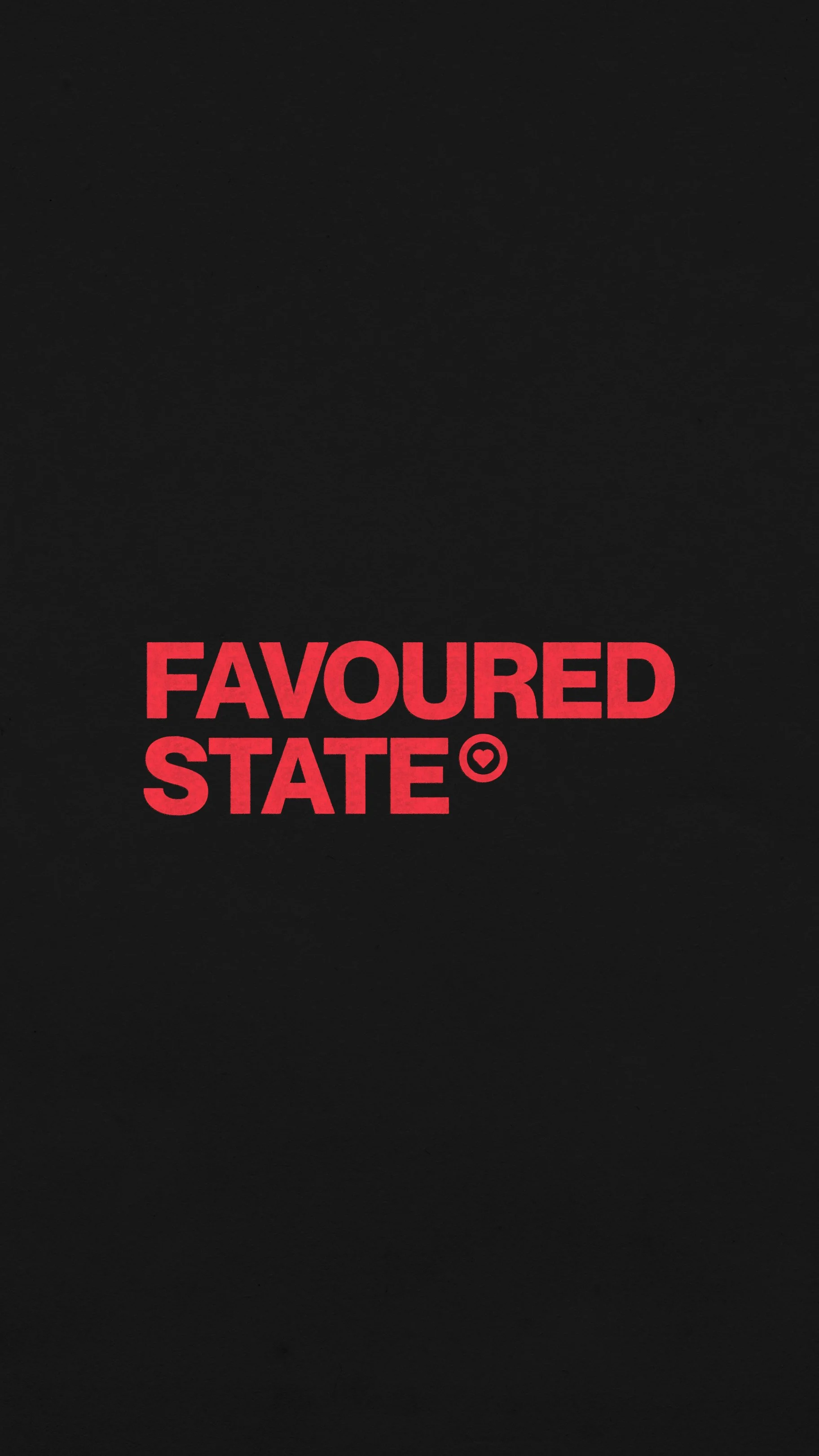
Primary logo – featuring a bold, timeless sans serif typeface paired with a custom heart icon, inspired by the copyright symbol. This is representative of Favoured State’s core ethos.
The colour palette – a mix of Red, Charcoal, Linen, White, and a pop of Pink – evokes intensity, passion, and a DIY spirit reminiscent of classic punk aesthetics while keeping a contemporary edge.

Custom icon suite.

I also created a styling moodboard for the band, integrating some existing looks and some additional suggestions for their on-stage presence.

Secondary logo mark inspired by a modern day skate brand, integrating a more organic type treatment paired with a hand distorted san-serif.
