


Brand Identity
Sproutly
Brand identity developed for Sproutly – a fail-proof, space-conscious vertical garden.
Sproutly is for those with limited space for a garden, but want to grow their own produce, lower their grocery bill or reduce food waste.
The Sproutly brand identity is colourful and full of personality. It consists of a typographic logo, complimentary typefaces, a colour palette, photography and shapes inspired by the Sproutly garden.

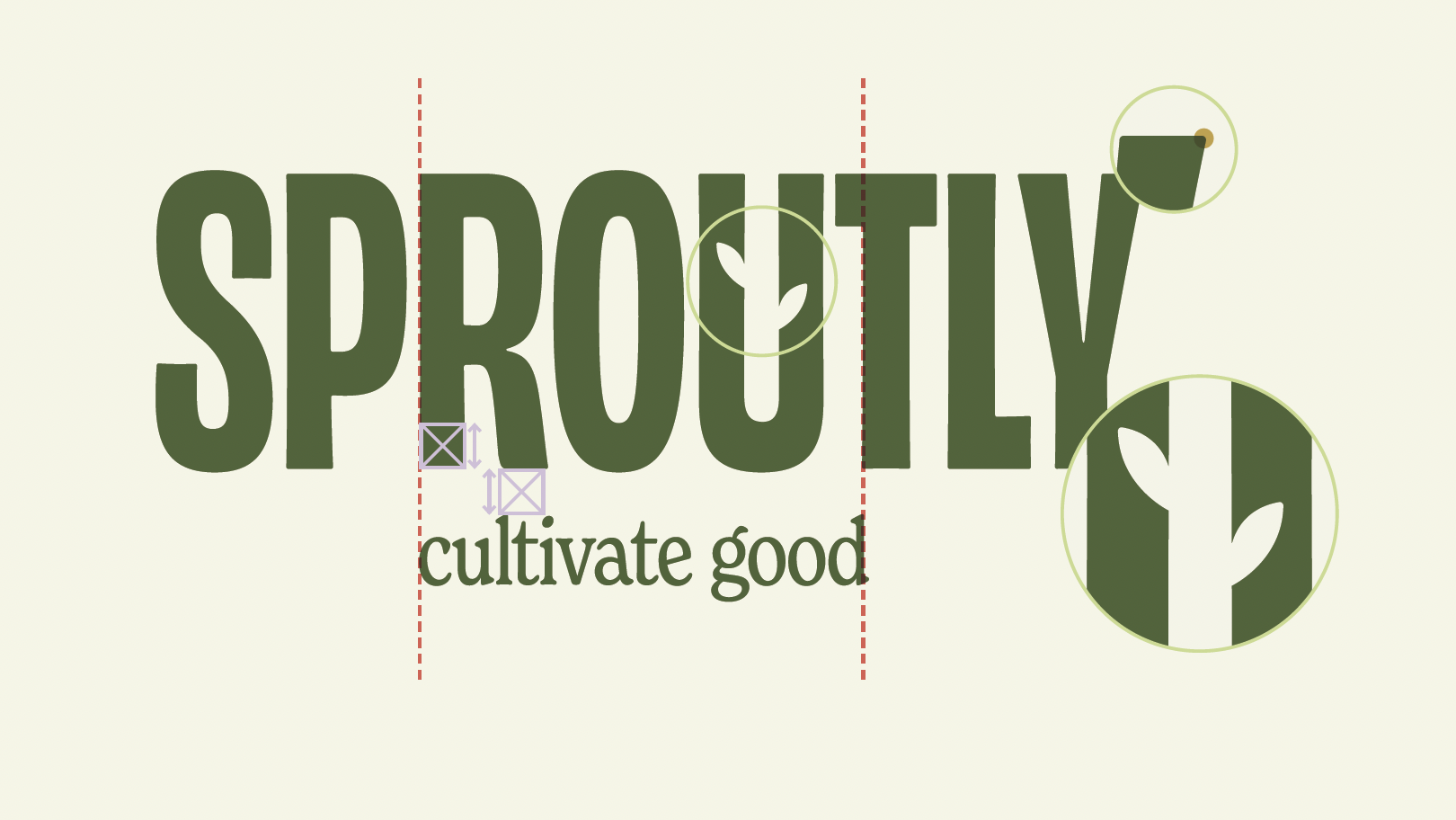
The Sproutly logo structure was carefully considered.
The tagline sits centered below the primary logo, aligned with the R and T.
The space between the logo and tagline is consistent with the width of the letter R. The use of negative space in the letter U to create stem and leaf details add a bespoke touch to the logo.
Lastly, the corners of the typeface have been rounded slightly, to reinforce the organic feel.


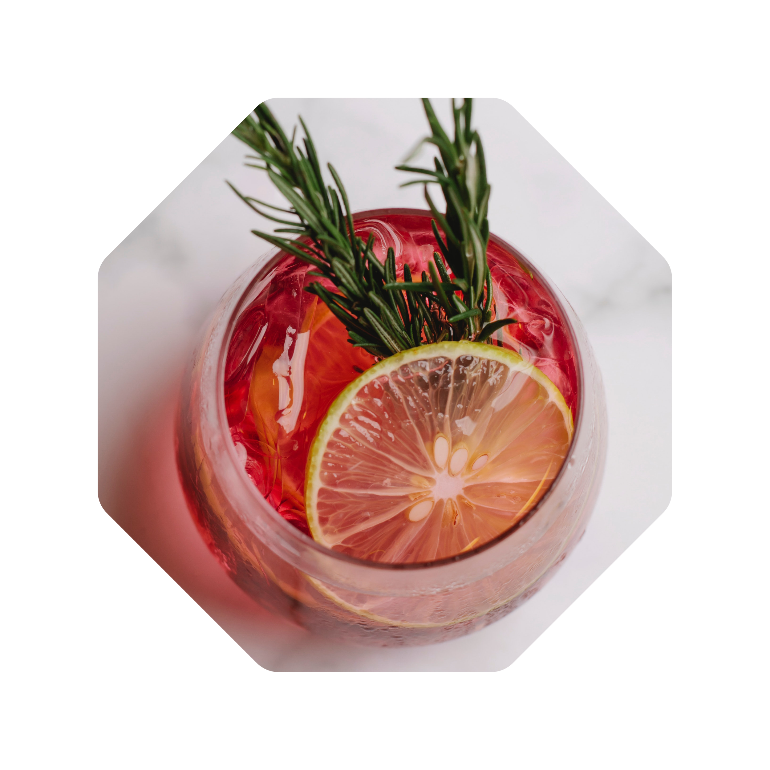
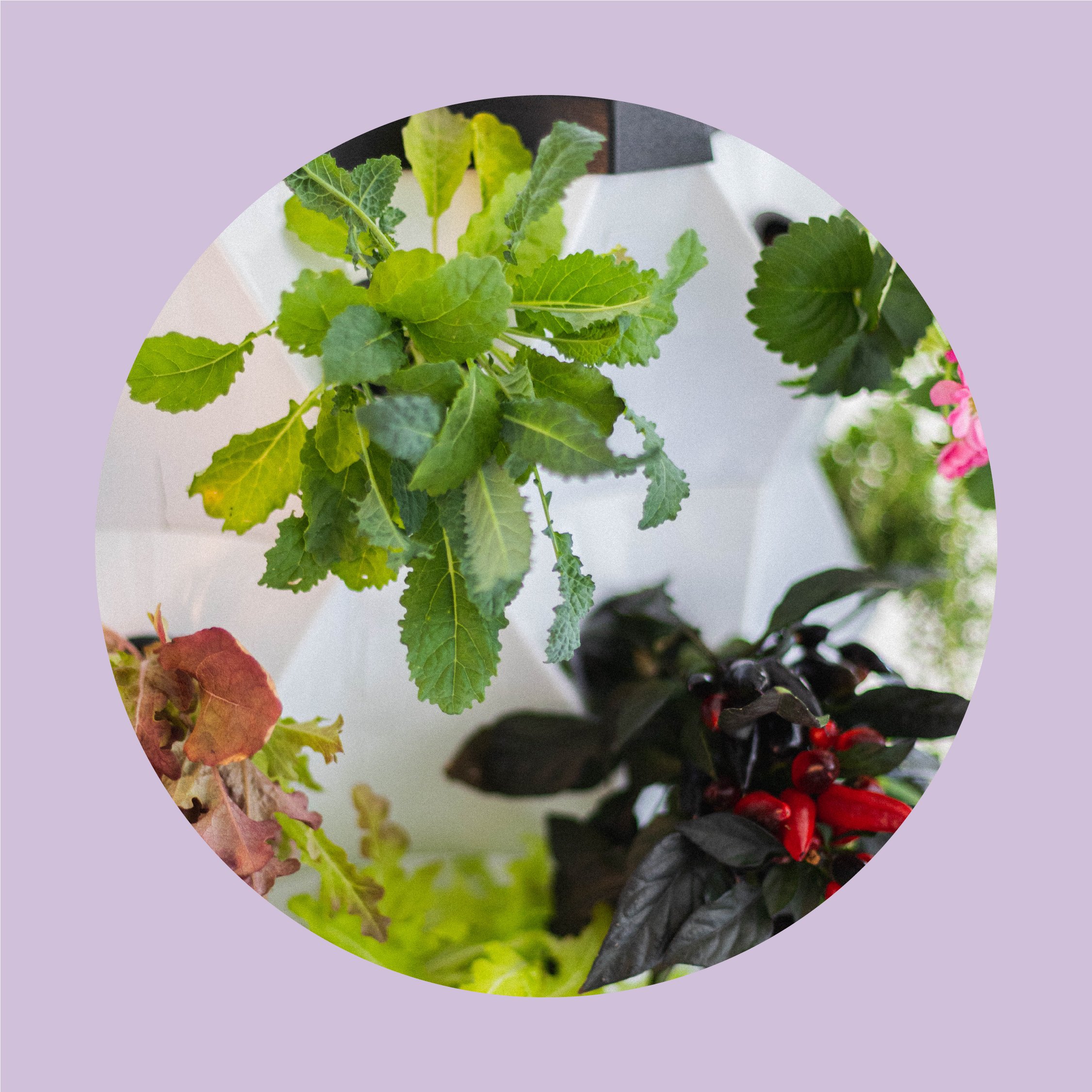
Styling the Sproutly garden on a photoshoot.


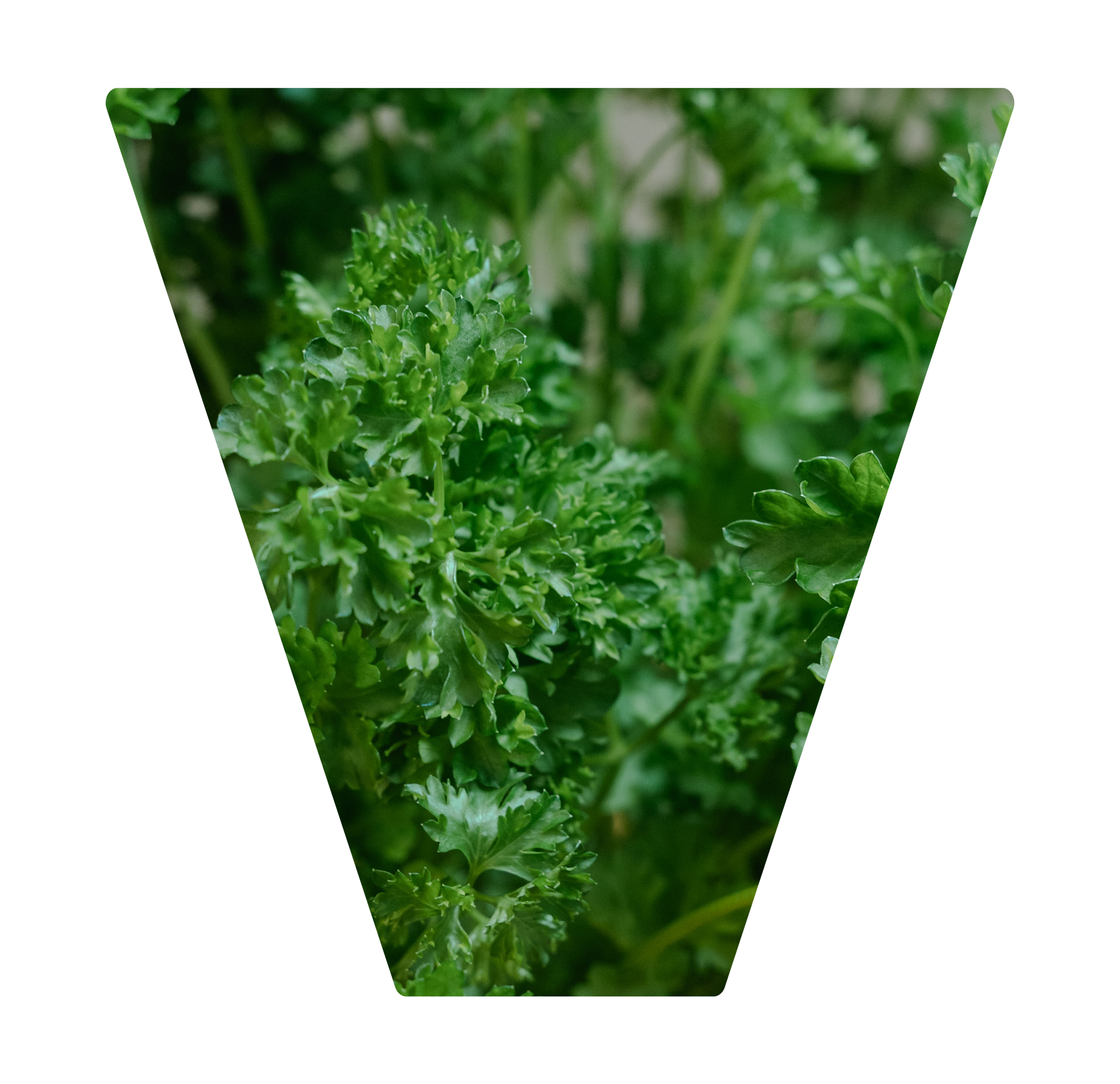
The colour palette is inspired by fruit, vegetables and herbs that can be grown in Sproutly.
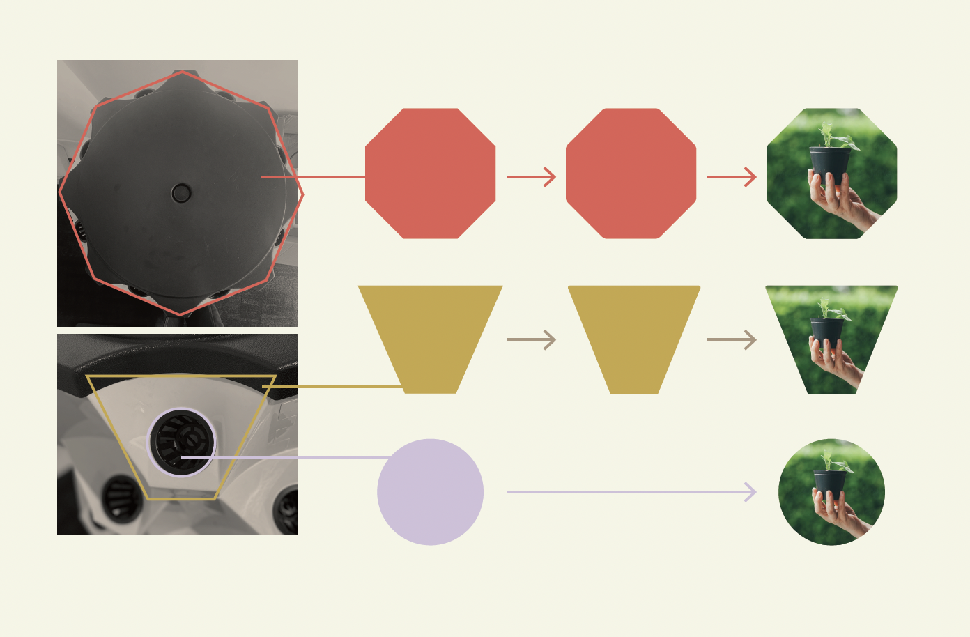
The brand shapes come directly from the Sproutly garden itself, creating a strong connection between the product and brand identity.


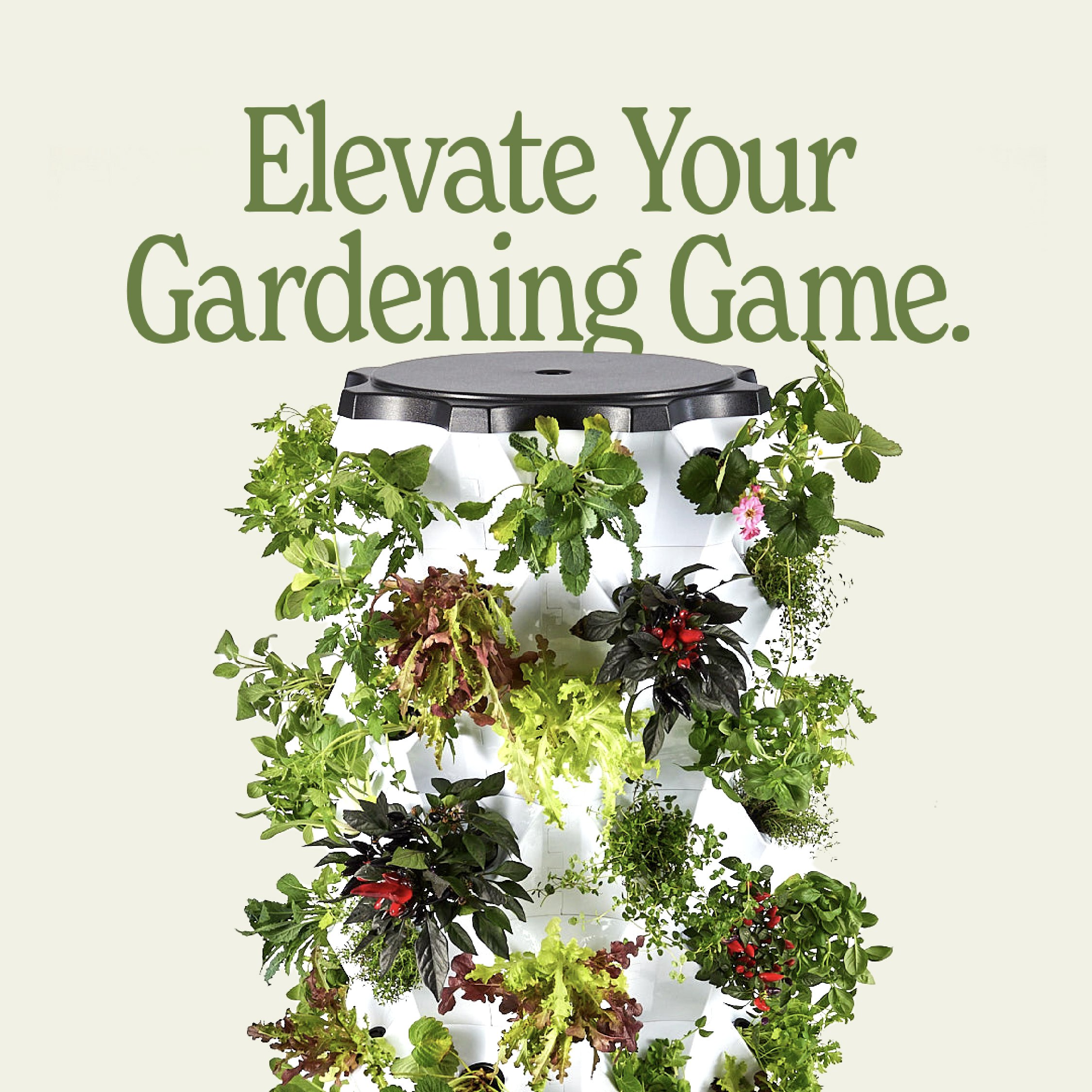


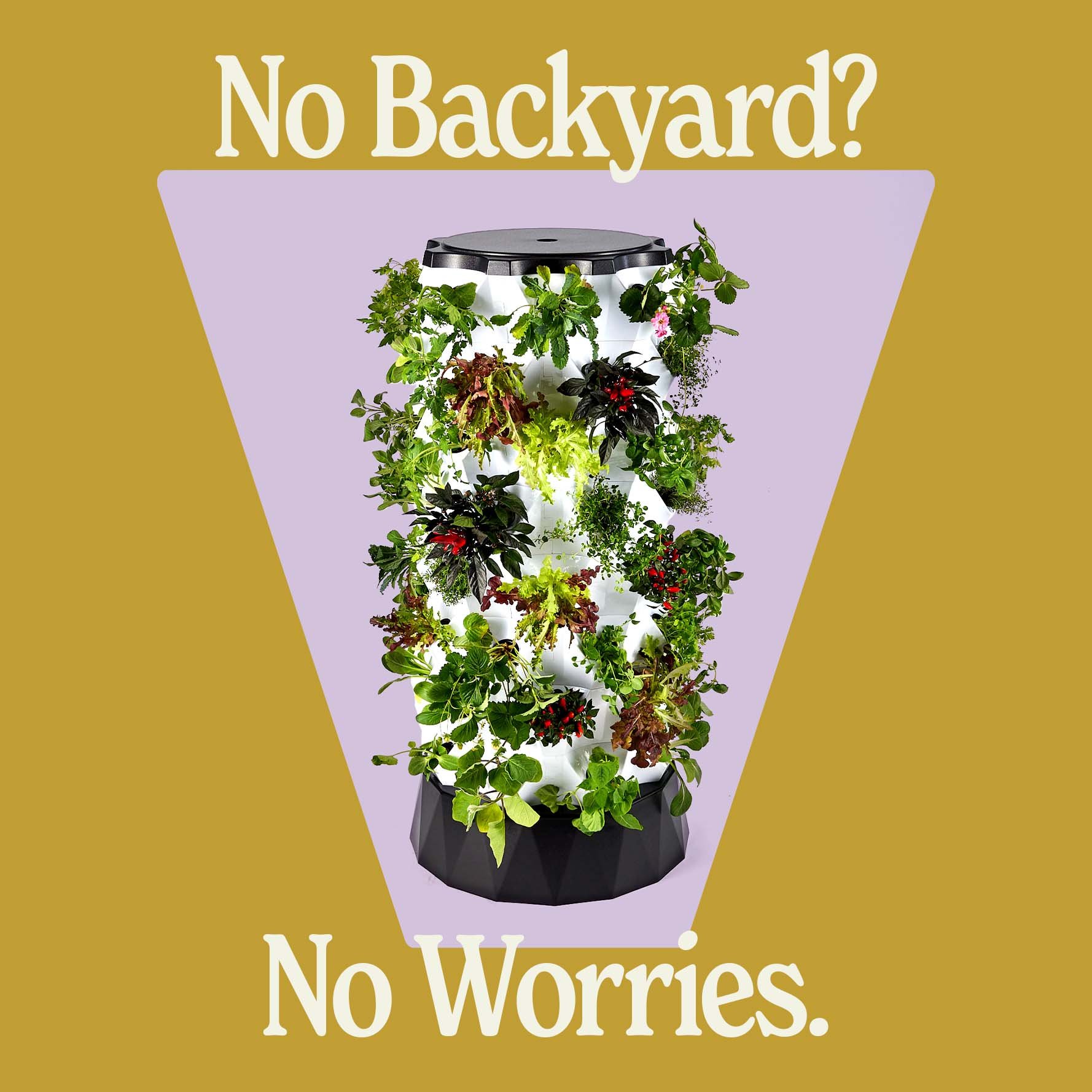
Social media tiles, where the brand really comes to life utilising all shapes, typography, brand colours and photography.
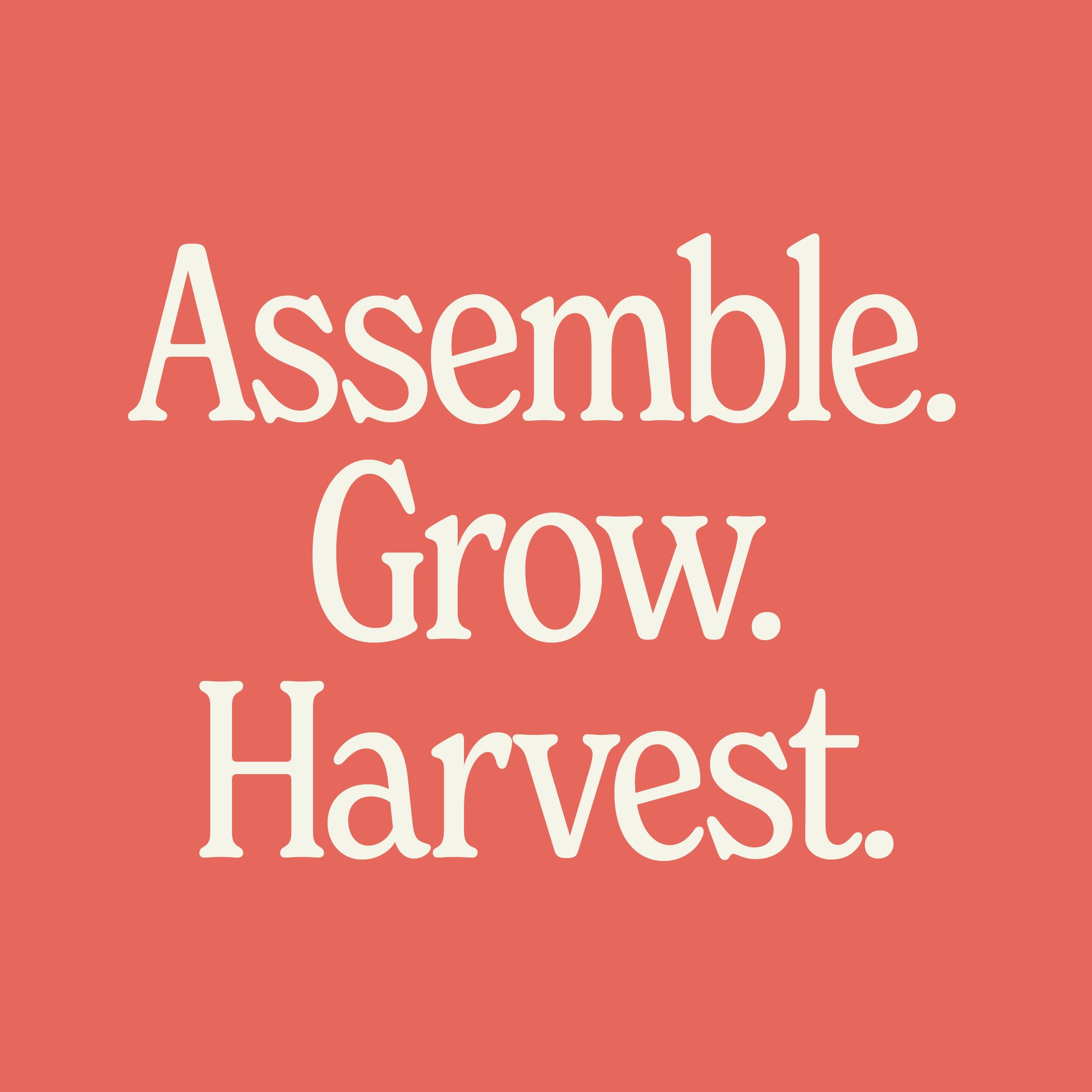
Sproutly’s fun personality comes through in not only the design but the playful copy.

Packaging system designed for ease and cost effectivenes – client to attach the labeled stickers to the respective seedling pouches when packaging.


Sproutly website design.